I saw the green Cardano branding at Consensus and really loved it - so much so that I think Cardano should officially go green and drop the blue branding completely.
My reasoning is this - the blue colour is very reminiscent of an overly corporate and old-fashioned style. Cardano.org currently reminds me of IBM’s corporate website circa 2009. We want our blockchain to be a vibrant and exciting place, not a drab corporate boredom-fest.
Also, we are not doing enough to push Cardano’s green credentials on the front page - many PoS blockchains lead with this as their main USP, Cardano.org barely mentions it. Make Cardano green!
Se podría llamar a votación y poner una serie de colores a elegir, si apuntamos algo ecosustentable como símbolo principal el verde es lindo, si apostamos a que ADA sea la moneda de pago del futuro no tan lejano mientras Bitcoin sea la moneda de resguardo de valor, el azul esta bien por eso, habría que definir antes sobre que estamos marcado para ver el color. Pero, si no es la principal actividad lo ecosustentable, mi apreciación es que el Azul es lindo, dado que también representa la imagen del océano limpiando toda la tierra del sistema FIAT obsoleto. Mis saludos
I totally agree that the small environmental footprint of the Cardano blockchain can be emphasized more prominently. The fact that the Cardano blockchain uses two factor of magnitude less energy than its closest competitors is under utilized in its message.
On the other hand I like the blue branding. It expresses overall clarity which includes clean air, clean water, but also includes clarity of code, development model, ethics etc. I think green would only express environmental consciousness, while the Cardano project aims to be conscious in many other ways too.
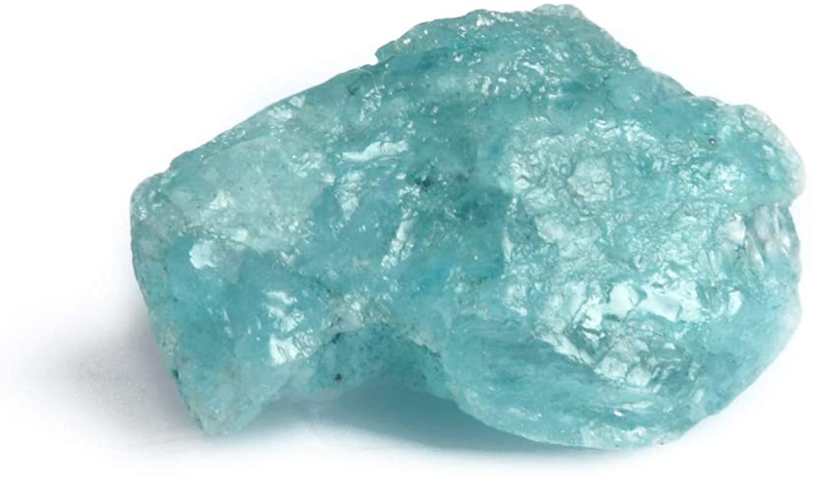
But I wouldn’t be against pushing it towards aquamarine.